
Project Overview
Description
AccelG2M is made up of proven strategists who partner with CEOs of
young technology companies to define and roll out a clear go-to-market
strategy to accelerate revenue growth and market leadership. They did
not previously have a website but needed one to represent their
business to potential customers.
Project Goal
Create a website to reflect the company and generate new business.
Requirements defined by the client were to look professional, be easy
to navigate, and clearly convey fairly large amounts of information
about their services.
Research
Customer
AccelG2M is a small company with only a few employees, but each of
them has over 25 years of experience in their field. The company was
about a year old when they decided they needed a website. They had
the beginnings of a WordPress blog, but realized that this did not
cover all of their business needs in the way a fully fleshed out
customized website would. They primarily needed a site to show to
potential customers information about their services and successful
past partnerships.
Interviews with clients revealed that the main priorities were to appeal to CEOs and venture capitalists and to show the value that AccelG2M creates for companies. They wanted the site to be professional but approachable and to show the city of San Francisco.
Interviews with clients revealed that the main priorities were to appeal to CEOs and venture capitalists and to show the value that AccelG2M creates for companies. They wanted the site to be professional but approachable and to show the city of San Francisco.
Industry
I researched websites for contractors of all disciplines as well as
trends for software startups based in Silicon Valley in various
stages of growth. In early stages, they were often simple, tending
towards minimalist, with white and blue colors. In later stages, the
general style remained, but the average number of pages (and
therefore the complexity of their menu) rapidly expanded as companies
began to explain their various services and products in increasing
levels of detail. Each product/service often got its own page and
pitch. Slideshow heroes were common here so that the main page could
display multiple different critical services.
Websites I found for contractors tended towards the much more simplistic with only a few pages, but were very heavily focused on explaining exactly what their services were to avoid confusion. Icons, images, and complex layout were more often excused for a website that read like a word document.
Websites I found for contractors tended towards the much more simplistic with only a few pages, but were very heavily focused on explaining exactly what their services were to avoid confusion. Icons, images, and complex layout were more often excused for a website that read like a word document.
Users
By the time we began building their website, AccelG2M had already
worked with roughly half a dozen companies. These were enterprise
technology companies in the $2M-50M range and each client must have
had a product and at least beta customers established prior to working
with the company. Each of these clients had heard about AccelG2M
through word of mouth.
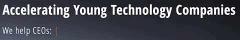
Key services AccelG2M provided and that future potential partnerships would be looking for were:
One of the main reasons previous companies wanted to work with AccelG2M was their proven experience so highlighting that experience and previous successful partnerships was essential.
Key services AccelG2M provided and that future potential partnerships would be looking for were:
- Go-to-market acceleration consulting
- Key executive hiring assistance
- CEO coaching
- Merger & acquisition planning and execution
One of the main reasons previous companies wanted to work with AccelG2M was their proven experience so highlighting that experience and previous successful partnerships was essential.
Prototype Iterations
Wireframes
Initial customer interviews lead to the idea of having four sections
on the main page, each of which would link to more detailed individual
pages: What We Offer, Team, Testimonials, Contact Us. These would
cover the main points that potential clients need to see: What
services AccelG2M provides, what their experience is executing those
services, proof that these services have worked for other companies,
and how to get in touch with them.
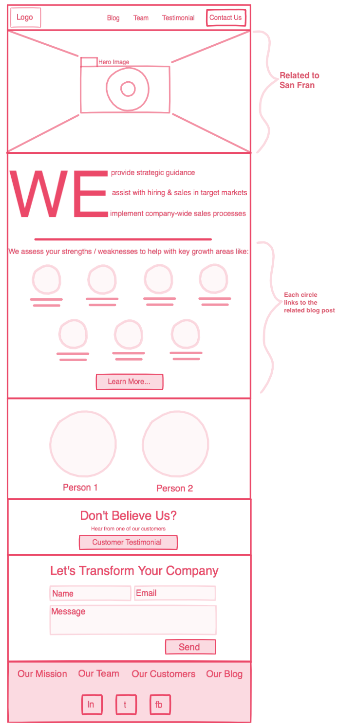
This is the wireframe of the main page that resulted from that first meeting.
This is the wireframe of the main page that resulted from that first meeting.
It contained each of those four important sections as well as a blog
page. AccelG2M had already been writing for the blog, and it was able
to provide potential clients who wanted it with even more information
on how AccelG2M could help them grow their business.
One of the main concerns that lead to the creation of this wireframe was on clearly explaining exactly what AccelG2M does. The first section after the hero is the longest in order to address this. The first half is meant to convey "This is what we accomplish" and the second is to elaborate on what the services they employ to achieve that.
The general layout was well received but needed a few changes. The client made two requests: that the Hero be related to San Francisco (since that is where they are based) and that the What We Do/Services section be more dynamic. Additionally, once the companies had given their permission, it seemed prudent to have the Customer/Testimonials section have the actual logos of past clients, instead of simply linking to another page.
With these changes and some altering of terms, the main sections changed to: Services, Company, Customers, Blog, and Contact Us. Each of these also had wireframes but they were excluded here for the sake of brevity.
Mockups of Services
After the general layout of each page was decided, it was time to
start making real mockups. There was a large focus in the designs on
breaking up information to make it easy to digest. The team,
testimonials, and contact sections were all fairly straight forward
and familiar to users during testing. However, the services section
seemed to be consistently the most confusing or overwhelming since
it had the most information. This problem first need to be addressed
on the main page and then on the actual Services page.
First, let's look at the main page. In the wireframe seen above, the services section was composed of two parts. In testing with users, this was deemed slightly confusing and made it appear as if there were two different lists of services on top of each other.
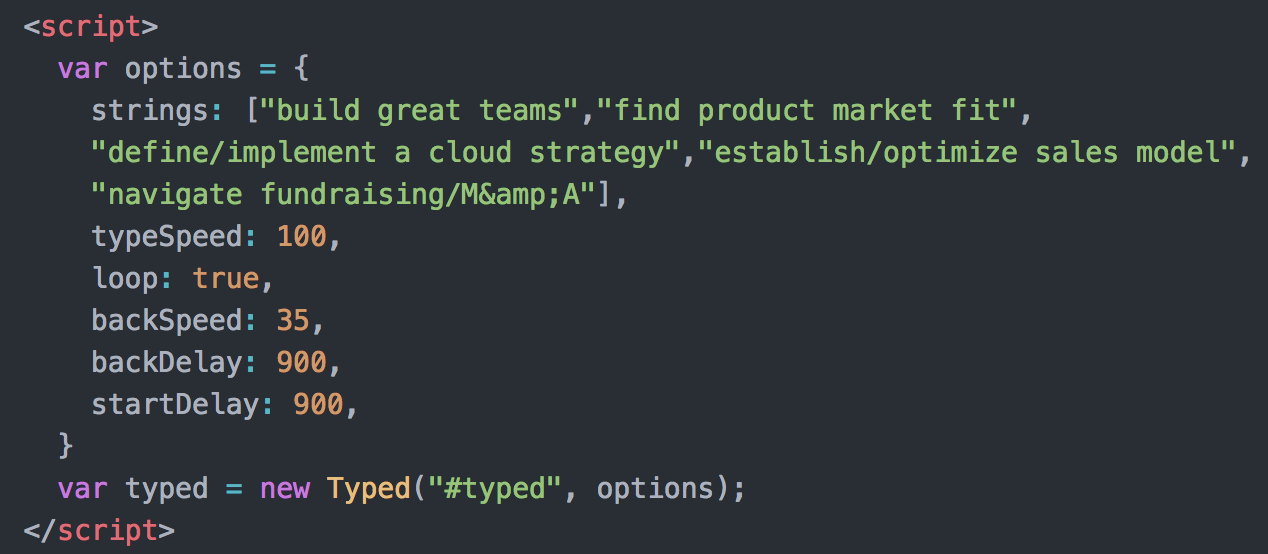
Due to this, it was broken up with the "We" portion being moved up into the Hero to become a tagline. These were the main reasons that CEOs and venture capitalists would be interested in AccelG2M so it seemed prudent to have those clearly displayed as the first thing you see on the site. This presented a slight UI problem because this meant having three to five lines of important text listed in the hero. Since each of the statements completed the same sentence, I realized it was possible to prevent clutter by switching out the end of each tatement so that it read "We help CEOs: build great teams."
This is the typing animation I eventually settled on:
First, let's look at the main page. In the wireframe seen above, the services section was composed of two parts. In testing with users, this was deemed slightly confusing and made it appear as if there were two different lists of services on top of each other.
Due to this, it was broken up with the "We" portion being moved up into the Hero to become a tagline. These were the main reasons that CEOs and venture capitalists would be interested in AccelG2M so it seemed prudent to have those clearly displayed as the first thing you see on the site. This presented a slight UI problem because this meant having three to five lines of important text listed in the hero. Since each of the statements completed the same sentence, I realized it was possible to prevent clutter by switching out the end of each tatement so that it read "We help CEOs: build great teams."
This is the typing animation I eventually settled on:
That solution worked out well, but breaking up the Services section
meant that now there was simply a bullet pointed list left behind
which is never an interesting way to convey information. AccelG2M
had nine key services that they provided which is a lot of information
to display without crowding. I initially tried laying out the different
services in three rows so each had an individual icons in a fairly
standard way.
However, during user testing, it appeared to be a section people
skipped past. Nine was too many discrete sections of information to take
in quickly so instead people tended to merely scrolled past it all together.
I decided to simply the section by removing the blurbs of information.
That would be provided anyway on the Services page when the user
clicked in, so it was merely cluttering the page.
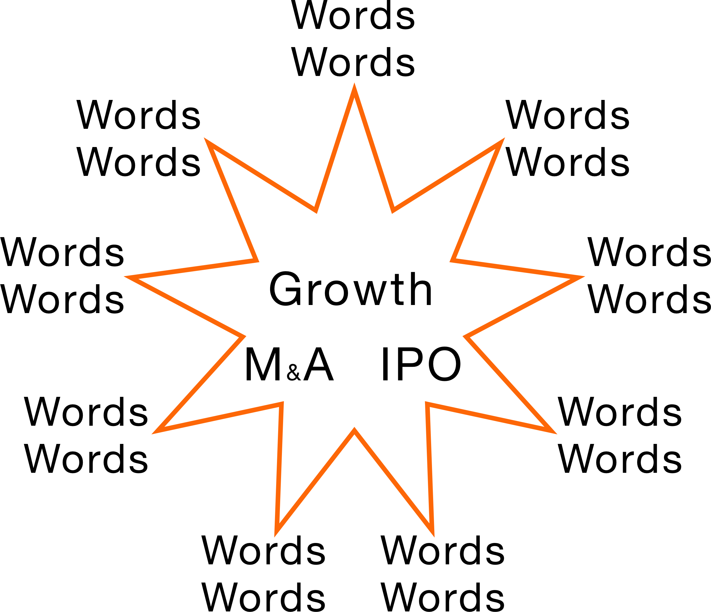
I then went through several different designs to make the section both more interesting and easier to parse. I also wanted the individual sections to visually interact with each other in some way, to come together so that the result appeared greater than the individual parts. These were the general shapes that resulted from brainstorming:
I then went through several different designs to make the section both more interesting and easier to parse. I also wanted the individual sections to visually interact with each other in some way, to come together so that the result appeared greater than the individual parts. These were the general shapes that resulted from brainstorming:
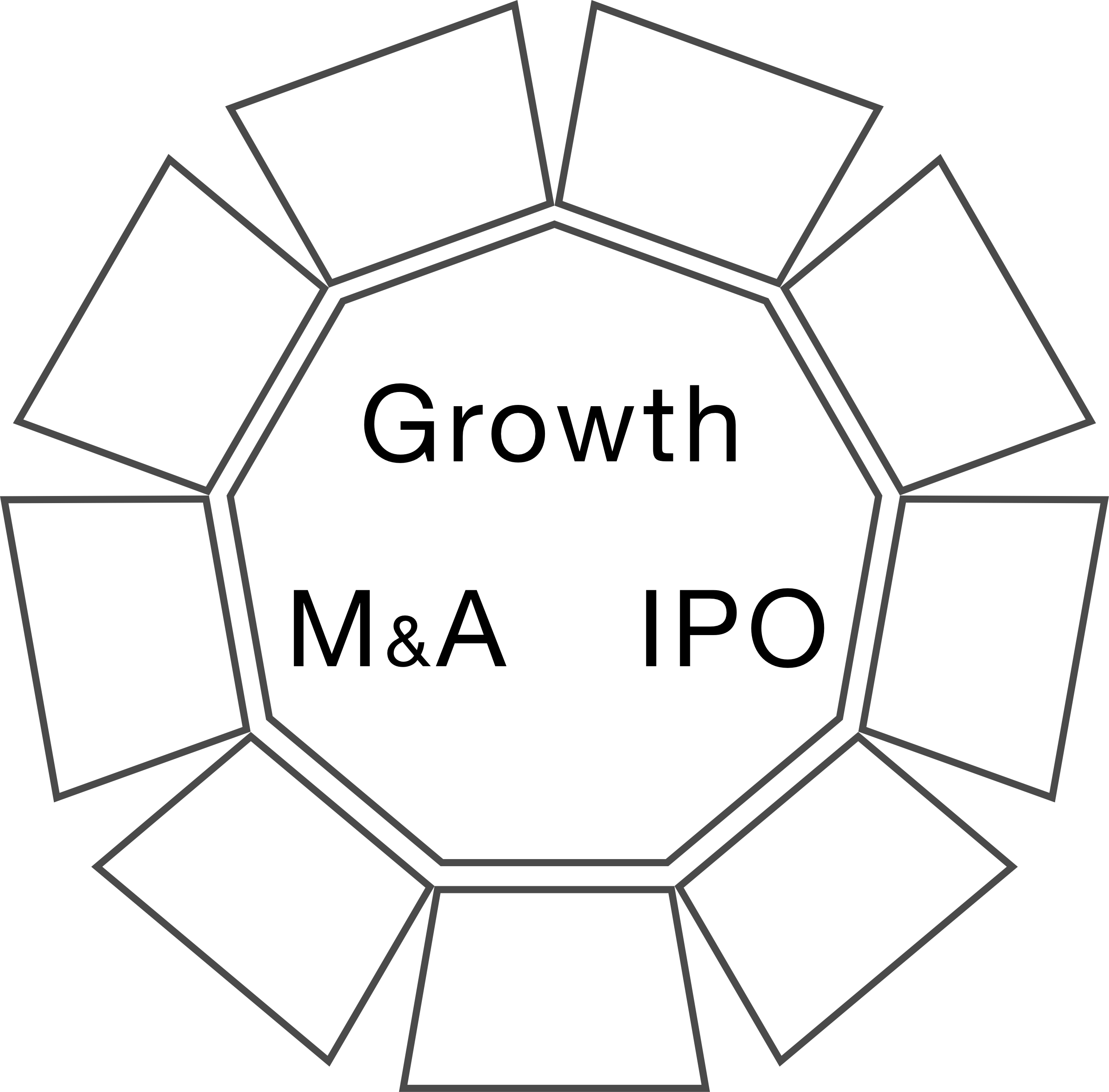
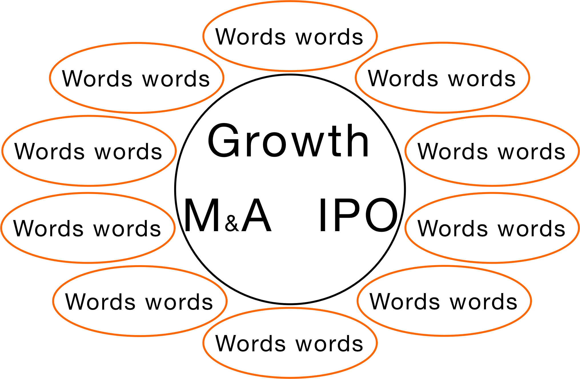
Both I and the client favored the general circular shape of the final
sketch above. By focusing more on a flower petal shape, this rough
sketch ended up being refined. By using CSS to create the pentagons,
JavaScript (and jQuery) to move them, and angular math to know where
to place them, the shape ended up being animated as follows:
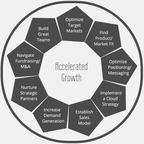
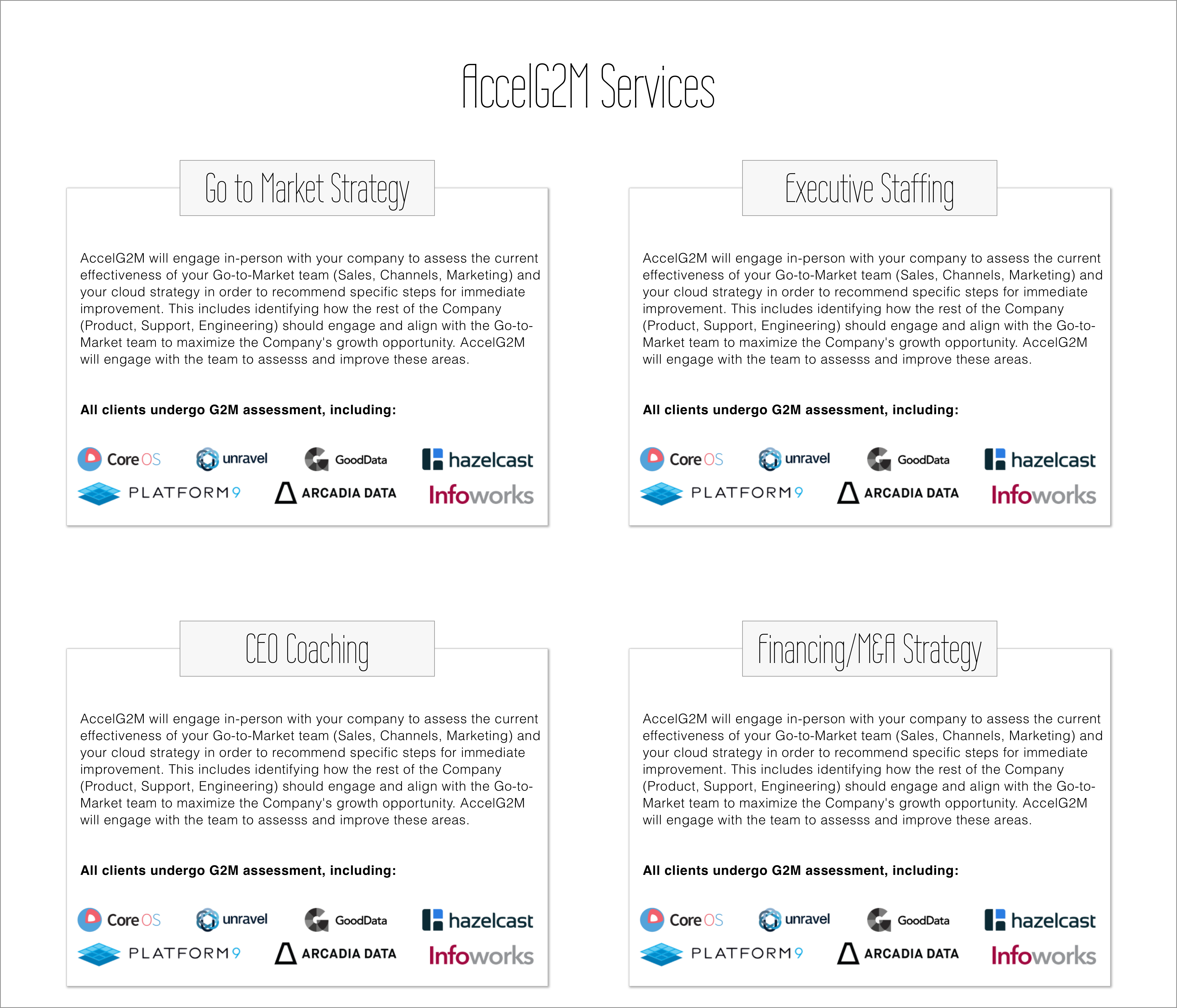
The services section was now taken care of on the main page, but
still needed to be addressed on the actual services page. Simply
listing each benefit or goal of all of AccelG2M's different services
could easily become cluttered blocks of text.
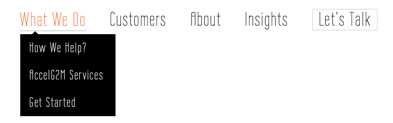
After a few mockups of the Services Page, it was determined that there was too much information to fit onto one page without it all blending together so it was broken up into three pages found via a drop down menu: How We Help, Services, and Get Started.
After a few mockups of the Services Page, it was determined that there was too much information to fit onto one page without it all blending together so it was broken up into three pages found via a drop down menu: How We Help, Services, and Get Started.
UI Note
A quick final note on the UI side of things, a large focus of the
designs was on balancing the colors of the site. The client wanted
the site to have company colors of bright orange, dark grey, and
white. I wanted to avoid either building a site that was pure white
or one that was overwhelmingly orange. Due to this, most of the
pages have very little color, focused on the simplicity of white
and grey, but use the orange as an accent color to highlight important
information such as links and titles. Pages that need more color,
such as those with customer logos on them, have no orange, and instead
focus on not having those logo colors clash strangely. For example,
in this Mockup, several logos are black and white until the user
interacts with them to prevent the page from looking chaotic.
Implementation
Most of the implementation involved standard CSS and HTML, with the
most complicated CSS being the use of grids. The exceptions to this
are the typing text in the Hero, the email service on the Contact Us
page, and the moving Services section on the main page.
Using Javascript libraries, the typing animation ended up being efficient to implement.
Using Javascript libraries, the typing animation ended up being efficient to implement.
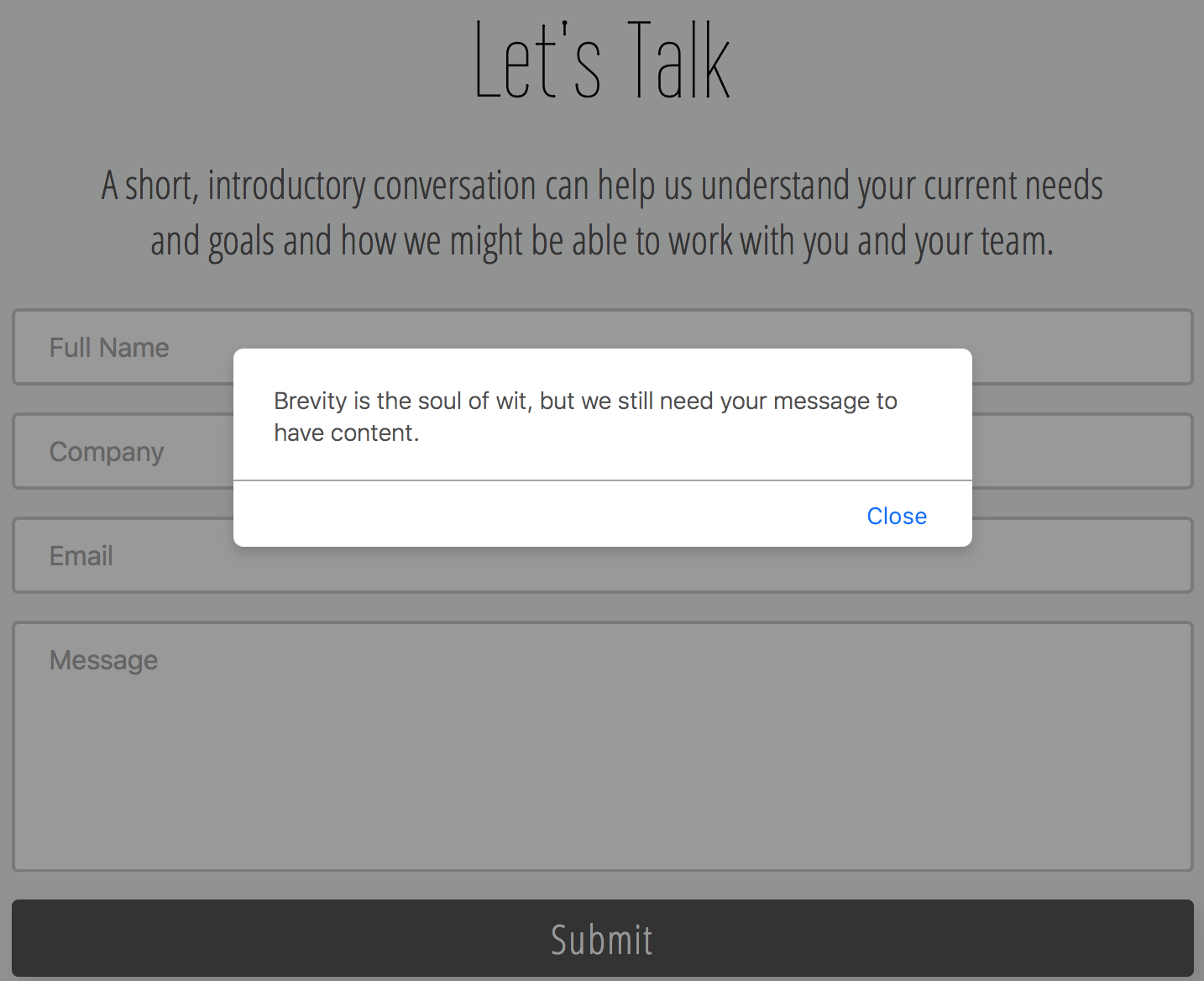
The Contact Us page uses jQuery and Amazon's Simple Email Service to
send an email directly from the site to AccelG2M. The email is auto
populated with the information provided by the user, and since it is
sent via AWS, the website's user never gets the clients' private
email addresses. It pops up alerts when the user's email has been
sent and when they hit the submit button without providing any
content (to prevent spamming).
Reflection
Successes
AccelG2M was happy with the final site, which ended up containing
seven pages (plus a 404 page). It balances the companies colors of
orange, gray, and white without being flat or overwhelmingly orange,
and it clearly communicates the company's services and mission
without being confusing.
Learning Moments
I explored more complex uses of JavaScript then I had in the past
and am happy with how it turned out. The typing text and the revolving
flower petals on the main page took some time to plan out but I am
excited to say they work seamlessly. Additionally, AWS in general,
but Amazon's Simple Email Service in particular, can be confusing
to navigate at first but with practice has become an essential part
of my tool belt.
Takeaways
This site was a study in balance. The layout of a website shouldn't
be flat and boring, but it also shouldn't be complicated to the point
of drowning out the message the site is trying to convey. It is
important to keep an open mind when designing a site and not become
too fixated on where information has to go or how it has to be laid
out. The is why user testing is important. Things can sometimes look
easy to understand to the designer who has been staring at it for
days on end, but confusing to the fresh eyes of your user. You're
building a website for your user, not for yourself and it's always
good to remind yourself of that from time to time.