
Project Overview
Description
HeartFelt wanted to create a machine-washable baby onesie filled
with wearable sensors to allow parents to reliably track their
baby's health. Whether the baby was in the next room or across
town with Grandma, the parent would be able to see what they were
up to, whether they were sleeping / crying / etc, and their health,
whether they had a temperature or high heart rate.
Project Goal
HeartFelt needed an app parents would use to interact with the
onesie. It needed to: display real-time information about the baby's
activity and health, show a large amount of historical data in a
clean and easy-to-read way, have a social section to drive engagement,
pop up notifications if the baby's information was outside normal
parameters, allow login, and allow settings management.
Research
Customer
Parents spend a lot of time caring for and worrying about their baby.
They want things that give them better access to knowledge about
their baby and allow them to anticipate or address some of their
concerns. Parents who were most interested were new parents or
millennials who are used to technology in every other aspect of
their lives. Their main concern was that the product be safe,
reliable, effortless to use, comfortable, and easy to clean.
Industry
At the time, there was not a similar product on the market. The
most similar product was a baby anklet which recorded a limited
amount of information and was not comfortable for the child. While
baby products as a whole tended towards cutesy and very gender-coded,
most apps and wearables would not inspire confidence if they looked
too childish and whimsical.
Wireframes
The wireframes ended up having these four main screens.
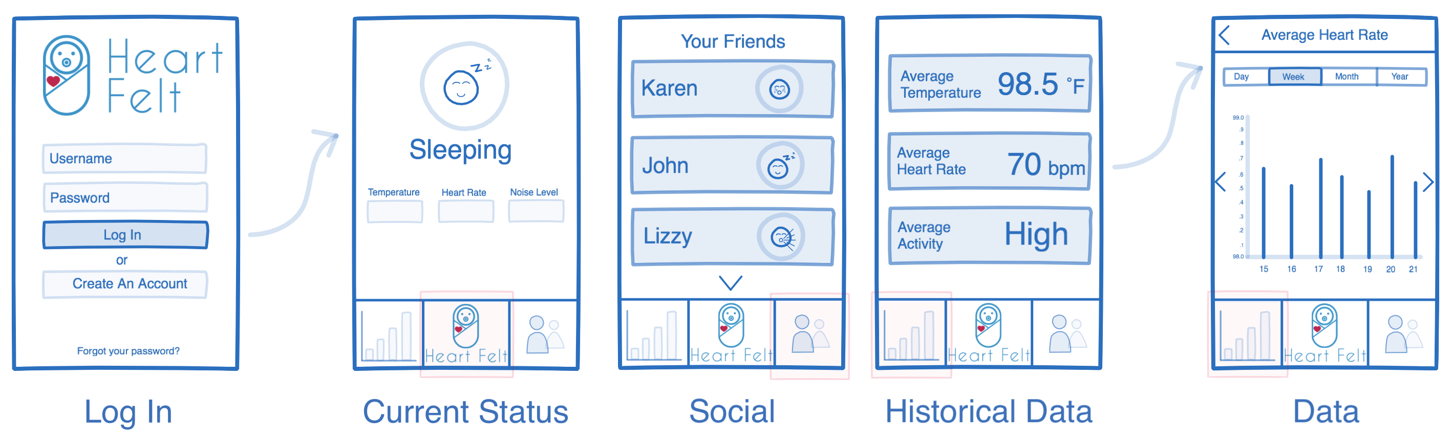
The app had to be extremely simple to use since parents did not want
to have to hunt for information, especially while sleep deprived or
worried about their child. The primary information parents cared
about ("Is my baby currently ok?") is prominently displayed on the
landing page of the app.
There were many talks with users before getting to this stage about what information was important to them. The designs started out far more complicated and got continuously culled down to only what users wanted to see. This includes: what is my baby doing right now (sleeping, crying, moving around, etc); do they have a fever or high heart rate; are they normal compared to other kids; how will I know if something is wrong? All of these concerns are directly addressed in this design.
There were many talks with users before getting to this stage about what information was important to them. The designs started out far more complicated and got continuously culled down to only what users wanted to see. This includes: what is my baby doing right now (sleeping, crying, moving around, etc); do they have a fever or high heart rate; are they normal compared to other kids; how will I know if something is wrong? All of these concerns are directly addressed in this design.
Reflection
Successes
All of the information presented is easy to find and understand.
Learning Moments
This was one of my first times doing UX/UI work for an app as
opposed to a website. They have different priorities, and I had
to learn how to design on a smaller screen where people expect to
see information presented without much text.
Takeaways
Creating wireframes is an important step that shouldn't be skipped
to get straight to mockups and implementation. It helps to flesh out
a design, to ensure that all of the important components are present,
and that the design is easy to navigate for the user. Your user
should never be confused while using your product, and it's your job
to plan out and test your designs ahead of time to ensure this is
true. This is the case for any UX design, but it seemed to be
particularly emphasized in this project where parents were often
already tired and overwhelmed prior to interacting with the app.