
Project Overview
Description
I eventually reached the point in my freelancing work where it would
be invaluable to have a centralized portfolio to show potential clients.
Early on in the design process, I decided the portfolio should be its
own example of my UX/UI process.
Project Goal
- Represent the quality of my work to potential clients
- Demonstrate my proficiency with UX/UI, HTML/CSS, and Javascript
- Explain my process and show examples of its implementation
- Be approachable but still professional
- Have fun and implement things I had not yet had the chance to work on
Research
Industry
I researched portfolios/websites for both UX/UI designers and
front-end engineers in order to find common trends in layout, style,
and content.
I found many UX/UI portfolios where the content was stunning but the website itself was created using WordPress or a similar service. Similarly, I found many websites created by front-end engineers that tended to lack any stylistic elements that would have come from a designer. I wanted to combine these elements into one website to demonstrate my ability to navigate these pitfalls and to work effectively on both sides of the aisle.
The most effective portfolios showed not only the finished product, but the detailed process needed to get there. This cemented the idea that I should create a more comprehensive site to document my workflow even though it added time and complexity.
Users
I talked to past customers about what they valued both in our past
working experience and in the websites they visited regularly.
Some of the more standard answers I received are that they thought websites should be easy to navigate, professional, and "interesting" or "cool looking".
Several mentioned that they appreciated how "prepared" I was. Many of them had never gone through the process of creating a website before and were glad that I helped them through that process. I often come into early meetings having already conducted extensive research and with some initial layout ideas. This means that basic wireframes can often be done by the end of one or two meetings which is reassuring to clients.
Another facet clients mentioned was the uniquely personal and full-service process. I can help with whichever stage the company is in, whether they just need mockups or want a full site. Several mentioned how it was useful that I was also able to help with the writing and positioning/branding of company on the site.
I believed that both of these points (the preparedness and the full-service) could be conveyed through the individual pages explaining my process.
Prototype Iterations
Goals
The site needed to include examples of well executed UI design,
HTML/CSS, and JavaScript. It needed to clearly outline the design
process without having an overwhelming amount of information. It
needed to have color without overpowering the photos/examples of
previous work, and to be dynamic without being overly complicated
or cluttered.
A stated goal was to avoid creating a pure white site with just a few boxes. It needed to be colorful and interesting but not unprofessional.
A stated goal was to avoid creating a pure white site with just a few boxes. It needed to be colorful and interesting but not unprofessional.
Initial Design
The design for this site has undergone many evolutions. Here,
I would like to highlight two of the main designs in the iteration
process.
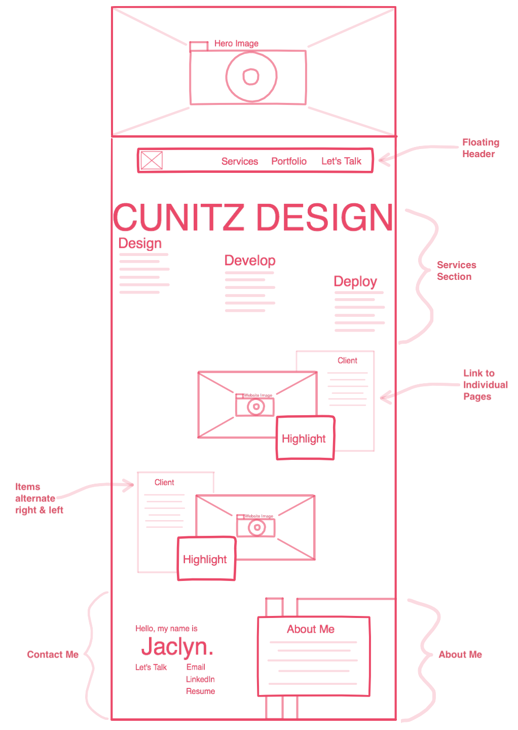
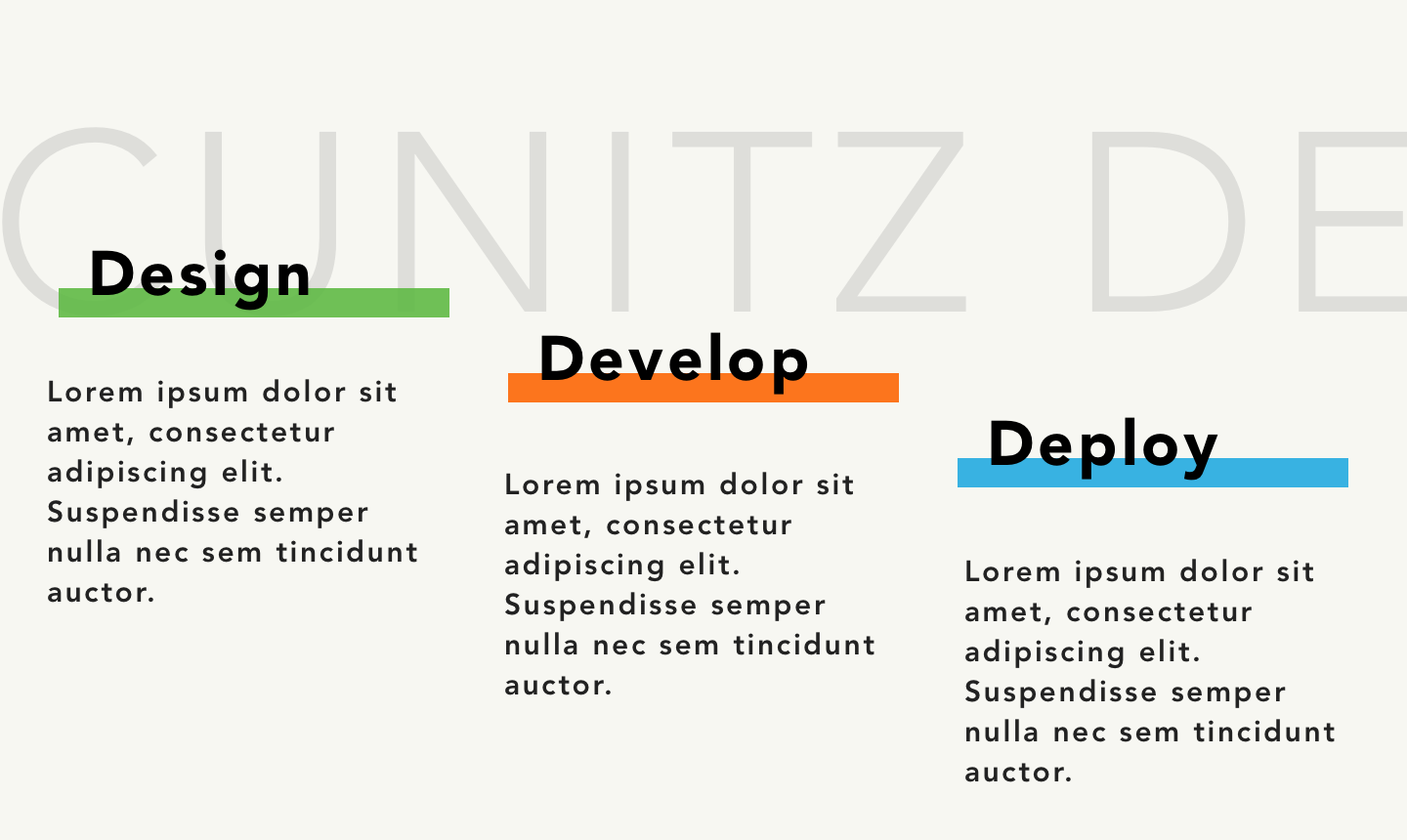
I knew the main page needed at least 5 different sections: a hero, my working process, the actual portfolio, a testimonial, and how to contact me. In addition, the portfolio section would link to several individual pages walking the reader through the process of creating each project.
I knew the main page needed at least 5 different sections: a hero, my working process, the actual portfolio, a testimonial, and how to contact me. In addition, the portfolio section would link to several individual pages walking the reader through the process of creating each project.
This design features very bright accent colors. Aside from an
admittedly bright hero (seen below), the colors were used in smaller
doses to highlight important information such as titles. You can also
see how I was experimenting with several different ideas on how to
display information in a simple and readable but interesting and
dynamic way.
The idea of a browser window being used to frame information came up again with the portfolio section. I didn't want everything to be linear and neatly boxed. The process and testimonial sections show this by displaying information on a diagonal or contained within various interlocking shapes.
As for the Hero, a lot of thought went into how it should look. It had to represent me and my work, be colorful and eye-catching, and invite users to explore the rest of the site.
Many ideas were considered and discarded including: an illustration of the Flat Irons in Boulder, colorful ink blots, and parallax scrolling shapes. The first two did not lend themselves to conveying much information. The final idea added unnecessary complexity to the site, and the parallax effect had long past the point of trendy into overdone.
I began testing the idea of having an image of a computer for the Hero. I enjoyed how meta it was, and it seemed a useful vehicle for conveying information about website design.
While good for flushing out some details, this design had some key issues:
- The design had no JavaScript or dynamic elements.
- The Hero was too simplistic. It was mostly one color and did not effectively demonstrate any particular skills or information.
- It wasn't highlighting the information it needed to. The ]Process section was more focused on the services I provide then my actual process of creating something. Additionally, the Contact and About Me sections needed to be separated so there wasn't too much information in one location and my experience wasn't located at the end of the page.
- Most of the information in the Portfolio section was redundant since it would be explained in more detail on its own page. What's more, the portfolio section ended up looking much more cluttered than anticipated with all of the images of the sites framed by a browser window. This needed to be simplified.
- The style and colors were too bright and not as cohesive as I wanted throughout the page.
Final Design
The final design made several important changes to address those
issues.
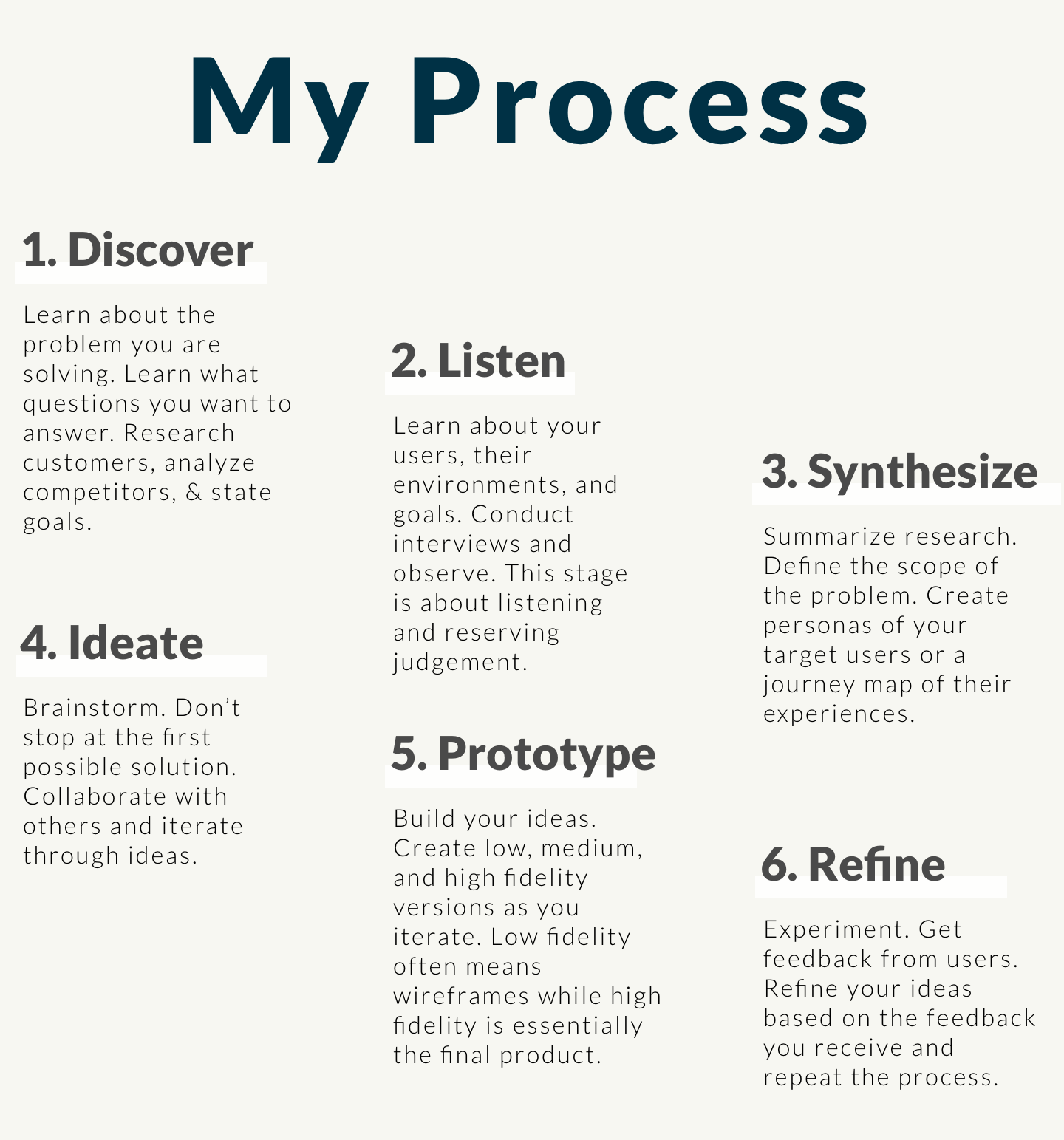
First, a separate About Me section was added, and the Process section was revamped to focus on the actual process of how I go about completing a new project. This layout made sure the information about my methodology that potential clients would want to see is highlighted instead of hidden. Since most of my clients had never made a website before, the Process section could act as a comforting step-by-step guide about how the work would progress that I could then elaborate on later in person.
First, a separate About Me section was added, and the Process section was revamped to focus on the actual process of how I go about completing a new project. This layout made sure the information about my methodology that potential clients would want to see is highlighted instead of hidden. Since most of my clients had never made a website before, the Process section could act as a comforting step-by-step guide about how the work would progress that I could then elaborate on later in person.
Second, it kept the main bulk of color to the header and footer with
everything else being a more minimalist navy, black, and white. This
saved visual space for the portfolio to shine on its own.
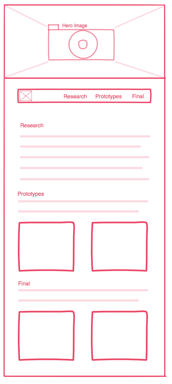
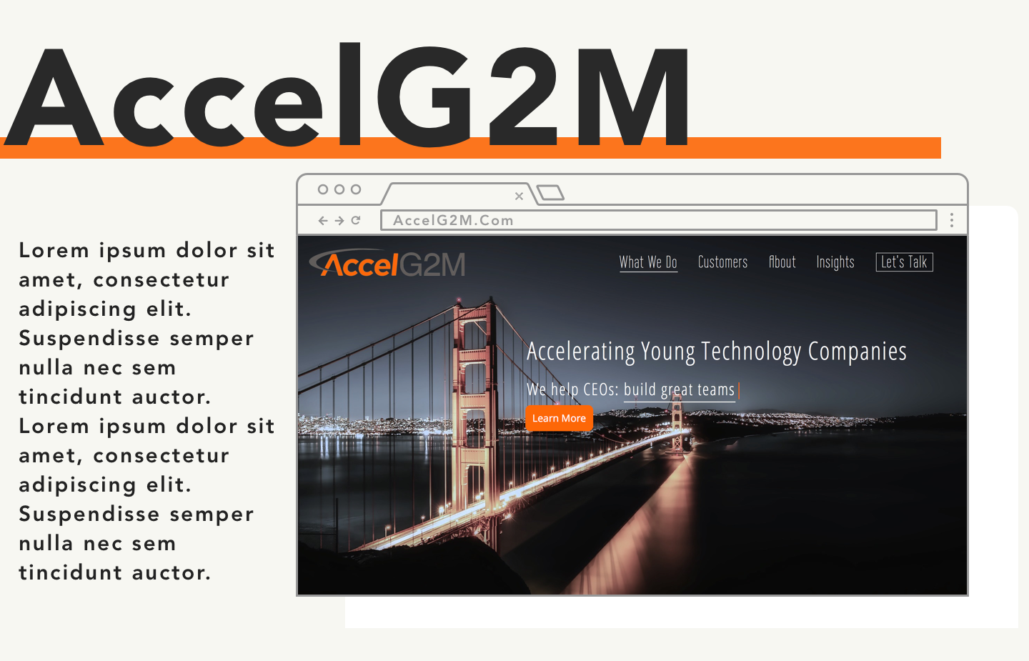
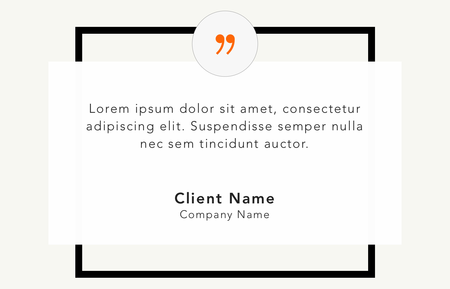
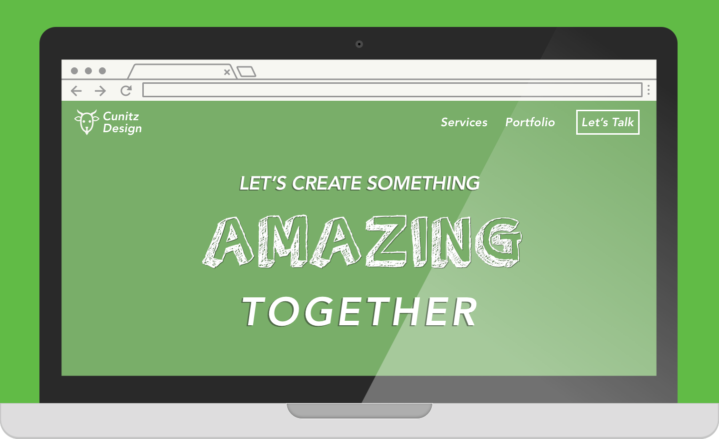
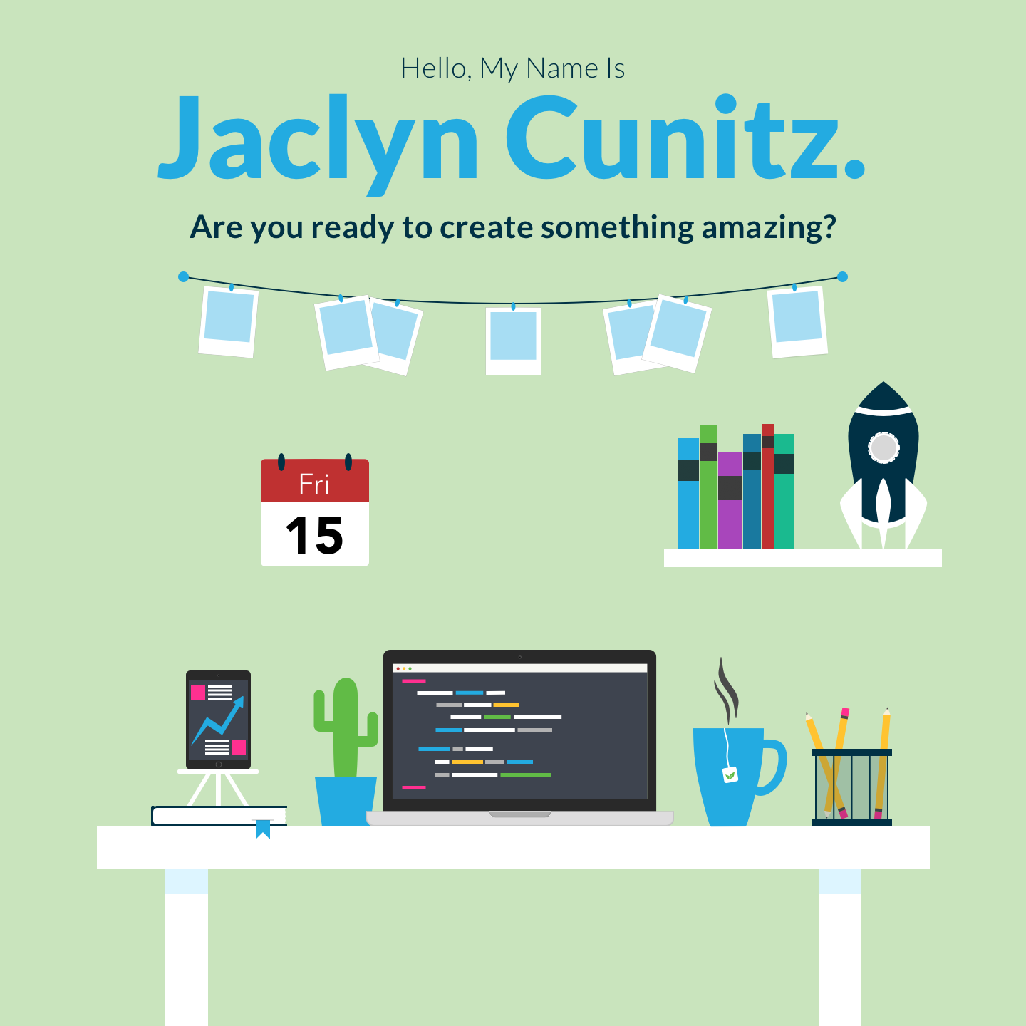
Third, the hero was changed significantly to reflect a flatter design. The computer is still present, but many other items are added to create a complete scene instead of a single, large item. There are several JavaScript elements now to add some interest, including a tea cup with animated steam, a calendar that changes to show the actual date, and the computer now types out little blocks of HTML. This flat design was then carried through the rest of the site, including the Contact Me section and the images for the portfolio. The large image of a computer is still present in the Hero of some of the individual pages, such as this one.
Third, the hero was changed significantly to reflect a flatter design. The computer is still present, but many other items are added to create a complete scene instead of a single, large item. There are several JavaScript elements now to add some interest, including a tea cup with animated steam, a calendar that changes to show the actual date, and the computer now types out little blocks of HTML. This flat design was then carried through the rest of the site, including the Contact Me section and the images for the portfolio. The large image of a computer is still present in the Hero of some of the individual pages, such as this one.
Implementation
Most of the code involves basic HTML and CSS with a focus on the
responsiveness of the page. The exceptions to this are the animations
and JavaScript in the Hero, the CSS grid layout in the Process section,
and the active sidebar navigation on both the main page and the
individual pages.
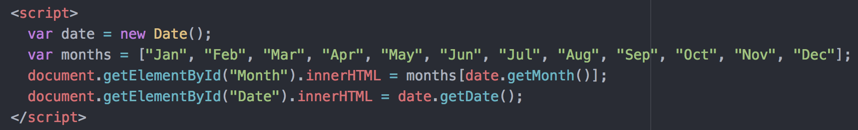
For the Hero, the steaming tea cup and the changing blocks of code on the computer are actually accomplished purely with CSS animations. The primary issue there was ensuring that they remained in position and scaled well for all screen sizes. The only Javascript used in the Hero was to ensure that the calendar always showed the correct date for the person viewing the page.
For the Hero, the steaming tea cup and the changing blocks of code on the computer are actually accomplished purely with CSS animations. The primary issue there was ensuring that they remained in position and scaled well for all screen sizes. The only Javascript used in the Hero was to ensure that the calendar always showed the correct date for the person viewing the page.
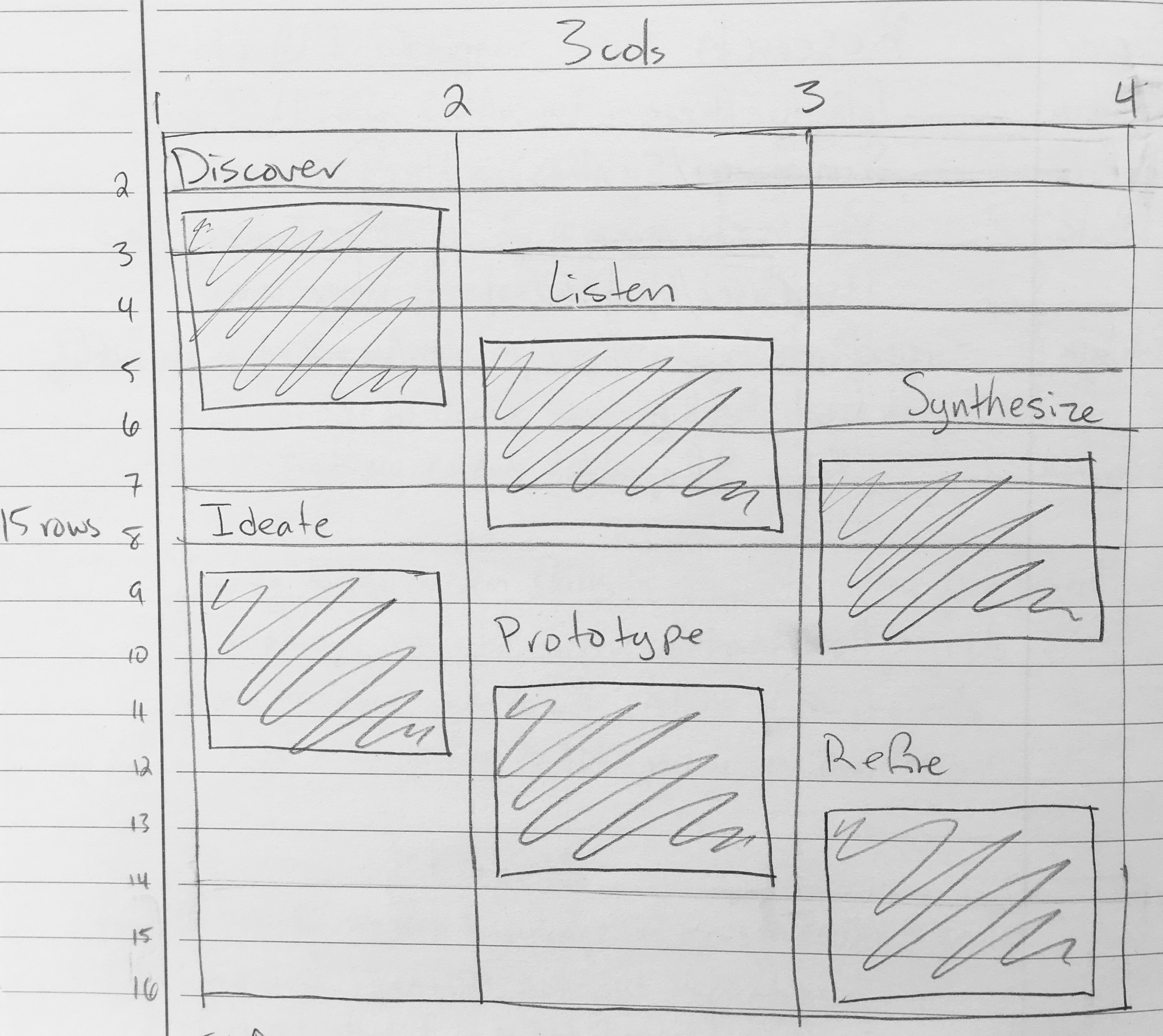
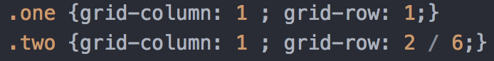
The CSS grid layout was actually more difficult to plan than to
execute. In order to create the diagonal lines of text, I decided
it would be more efficient (and fun) to use a grid instead of flex
boxes. This ensures that the boxes easily remain in position no
matter the size of the screen and don't need precise CSS margin
properties.
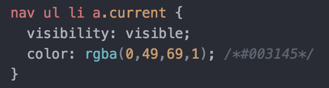
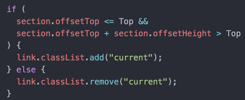
I wanted the sidebar to act as a dynamic table of contents that would
give users context as they scrolled. They would always know what they
were looking at and easily be able to find any information that they
wanted. This was accomplished with a script that would keep track of
how far the user has scrolled and toggle on the current attribute for
whichever section they are on. This would switch out the CSS for only
the current section and allow the rest of the menu to stay the same.
Reflection
Successes
The flat design of the site ended up being very cohesive.
It manages to have a fairly simple layout while still being
colorful and engaging. Both the sidebar, with its smooth scrolling
and active navigation, and the small animations in the Hero are a
good demonstration of my skill with CSS and Javascript. They also
look professional and the sidebar helps users to find any information
they might want.
The individual pages ended up containing quite a lot of information, and I think they do a good job of demonstrating my thought processes and showing how I approach problems.
The individual pages ended up containing quite a lot of information, and I think they do a good job of demonstrating my thought processes and showing how I approach problems.
Learning Moments
On the implementation side of things, this website utilized more
advanced Javascript than I was used to, and, although I had also
used basic CSS grids before, I had never had the opportunity to use
them in quite this overlapping and fun way.
Additionally, writing out my methodology and going back through my old work, even that which didn't end up in this portfolio, ended up being a very useful process for me. I could see how I had improved over time and make notes of where I would make adjustments if I went back. It helped me to see which skills I might want to brush up on or keep improving. Also, officially codifying my UX/UI process is something that can help me when moving forward into future projects.
Additionally, writing out my methodology and going back through my old work, even that which didn't end up in this portfolio, ended up being a very useful process for me. I could see how I had improved over time and make notes of where I would make adjustments if I went back. It helped me to see which skills I might want to brush up on or keep improving. Also, officially codifying my UX/UI process is something that can help me when moving forward into future projects.
Takeaways
Experimenting with new things is how one learns new skills and grows
creatively. It's important to push your boundaries to keep expanding
them. Going back through your old work every now and again allows you
to track your progress, to see what skills you still want to improve,
and to get inspiration for future projects.