
Project Overview
Description
Rapidity Networks was an Internet Service Provider (ISP)
based in Colorado who needed a website to represent their startup.
They already had a front end engineer on staff, but needed some
assistance with UX/UI design.
Project Goal
Requirements defined by the client were that the mockups had to look
professional and engaging, but approachable and fun. It had to appeal
to customers, investors, and business partners, and it had to show or
represent the towns and municipalities they were serving.
Research
Customer
Rapidity wanted the designs to be more approachable than the large
companies they were competing against. They wanted to show that
they were a smaller, more local company that actually cared about
their customers. This is why they wanted an emphasis on the people
and areas they were serving or going to serve. They also wanted the
website to reflect that they were very focused on privacy and
ethical business practices.
Industry
I conducted research on existing ISPs and found them to
overwhelmingly use the colors blue and white. Most of the sites
were very clean and professional and usually had one "gag" that's
meant to be more approachable. This included one line half-jokes or
just a picture of happy people. None of the sites put any prices on
the main page or anywhere easily viewable. Users had to search for
that information or often call the company since prices often
fluctuate based on the area the customer is in and what level of
service they ask for.
Users
Quick Preface: Rapidity needed a standard website to demonstrate
their mission and services to potential customers and potential
investors. The portal where customers could manage their account
and customer service representatives could see their information
and assist them is a separate entity. Rapidity was just beginning
to work on that part of the website at the time. That being said,
there were three different main groups of users with this project,
each needing their own considerations.
First, are the customers and potential customers. These users want to know whether Rapidity is in their area, that their private browsing information isn't being used or sold without their consent, and how they can sign up for fiber internet through Rapidity.
Second, are the representatives of various municipalities. This groups wants their constituents (the customers) to he happy and willing to reelect them.
Third, are the investors. They want the site to look professional and to draw in more customers.
Final Mockups
Here are three pages of the final mockups for Rapidity Networks.
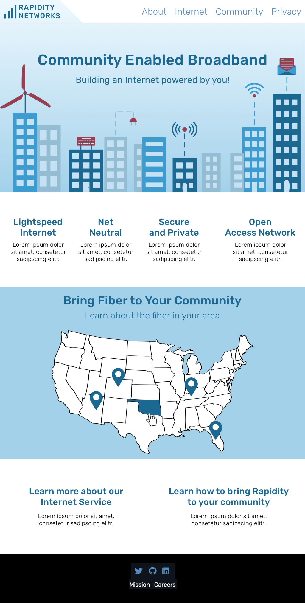
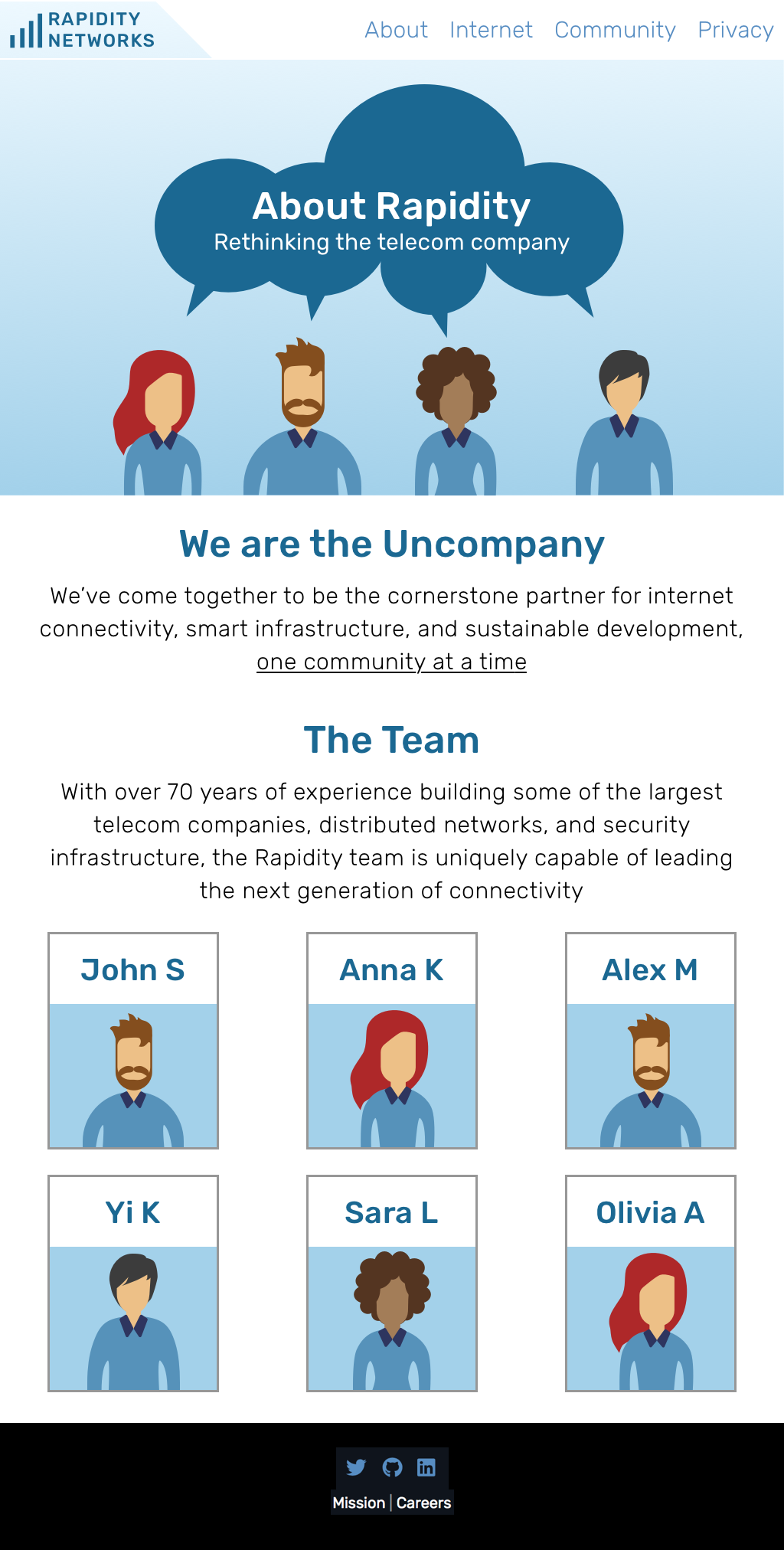
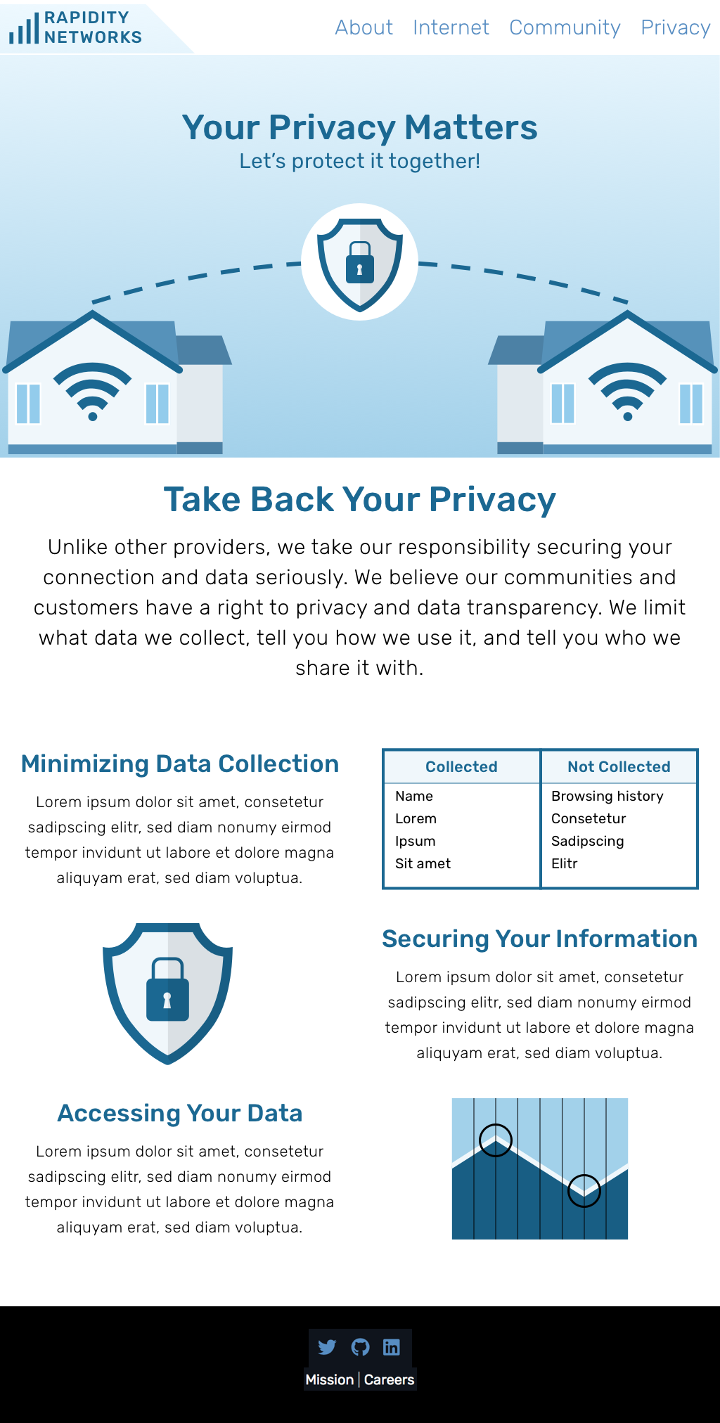
The main idea the mockups needed to reflect was that behind the
company is a group of real people who are trying to help. Going to
competitors' sites and trying to use their services is intimidating.
The sites feel lifeless and trying to work with telecom companies is
notoriously difficult and mind-numbing. These mockups needed to be
the antithesis of that. Instead, this site focuses on community, on
the idea of helping local people and their towns. This can be found
in particular on the main page and community page, but is woven
elsewhere too. On the teams page, you can see pictures of real people;
on the privacy page you can feel how important it is that the company
put its customers first and not sell their personal info; the internet
page focuses on how fiber internet can help YOU, your family, your
town. This concept is present not only in the text and the simple
layout, but also in the style which, while professional, is aiming
for approachable and friendly.
The largest challenge with this site was designing it to meet all of the users needs. The first group of users, the customers, are addressed throughout the site, but primarily on the main page and the internet page. The second group, the local representatives, are directly addressed on the community page, which shows them how to get their own town partnered with Rapidity and wired up with fiber. Their concerns are also addressed on the internet page, since shows how their constituents will be happier with easier, faster internet, which in turn makes them happy. The potential investors are shown the team they would be investing in, what Rapidity's mission is, and what services they offer.
The largest challenge with this site was designing it to meet all of the users needs. The first group of users, the customers, are addressed throughout the site, but primarily on the main page and the internet page. The second group, the local representatives, are directly addressed on the community page, which shows them how to get their own town partnered with Rapidity and wired up with fiber. Their concerns are also addressed on the internet page, since shows how their constituents will be happier with easier, faster internet, which in turn makes them happy. The potential investors are shown the team they would be investing in, what Rapidity's mission is, and what services they offer.
Reflection
Successes
I like the uniform blue design that manages to be approachable and
yet still professional and informative. The focus on community
managed to come through without being too overpowering or feeling
fake. Information is very easy to find and clearly laid out on each page.
Learning Moments
The most difficult part of this project was making sure to balance
the concerns of multiple groups of users. I had to be very discerning
about what information was most important to each group and what
could be left out to prevent clutter.
Takeaways
Know your user. Know what they want, and what's most important to
them. Don't be so focused on what information you want to share that
you forget what information your user is looking for.