Project Overview
Description
For more than 30 years, The Winston School has successfully educated
bright children whose learning differences have made succeeding in a
traditional school difficult. This San Diego school teaches students
in a way that traditional schools just can't.
The Winston School was beginning to fund raise for rebuilding their aging campus. They were thinking of making a website to share information about their capital campaign fund with potential donors. However, they were still in the planning phase, so instead of a full website, they were interested in mockups of what this hypothetical site would look like.
The Winston School was beginning to fund raise for rebuilding their aging campus. They were thinking of making a website to share information about their capital campaign fund with potential donors. However, they were still in the planning phase, so instead of a full website, they were interested in mockups of what this hypothetical site would look like.
Project Goal
To create professional website mockups that shared the Winston
vision, convinced people to donate, matched the style of the existing
school website, and potentially allowed donations through the site.
Research
Customer
The main take away I got from meeting with The Winston School was
how proud they are of their students. The main idea they wanted to
highlight was the school's vision and how what they're trying to do
for their students is different from what you'll find anywhere
elsewhere. They wanted to emphasize how all funds collected from the
capital campaign funding will go directly to visible improvements
that help their students learn.
They were also in the middle of considering several different paths. School administrators were trying make several key decisions: whether to have one fund that would be spent in stages or multiple funds so people could pick which projects they wanted completed; whether you should be able to donate on the site; and whether or not there should be a separate area of the site for high profile donors who needed more confidential information.
They were also in the middle of considering several different paths. School administrators were trying make several key decisions: whether to have one fund that would be spent in stages or multiple funds so people could pick which projects they wanted completed; whether you should be able to donate on the site; and whether or not there should be a separate area of the site for high profile donors who needed more confidential information.
Industry
I researched other capital campaign fund websites for both high
schools and colleges. There were fewer high school campaign sites
than university ones and the ones that were available tended towards
simplistic. They were usually just one page with a hero image of
students in front of the school. There was usually just a short
description of the school and/or of the work they wanted to accomplish
with a contact us to donate section.
The university campaign sites were far more complex. They were often had several pages of detail about the school, about the students, about what the money would go to, about why people should donate. They often had far more statistics and numbers to back up their claims and made a point of saying donations are tax deductible. Many of the universities had everal different funds people could donate to, so people could pick how their money was being used. All of the university sites I found allowed donations through the site.
The university campaign sites were far more complex. They were often had several pages of detail about the school, about the students, about what the money would go to, about why people should donate. They often had far more statistics and numbers to back up their claims and made a point of saying donations are tax deductible. Many of the universities had everal different funds people could donate to, so people could pick how their money was being used. All of the university sites I found allowed donations through the site.
Users
Capital campaign funds often have only a few large donations, as
opposed to many smaller ones. They are almost all from parents of
current or previous students, or occasionally students who will be
attending in the future. Parents want to donate because they want
to help their child or show their appreciation for how their child
was supported in the past. Because they primarily care about making
sure students' needs are addressed, it seemed prudent to ensure
every part of the site was focused on the children. It couldn't be
about what I or the school board wanted to say, it had to be what
parents wanted to hear.
Prototype Iterations
Wireframes
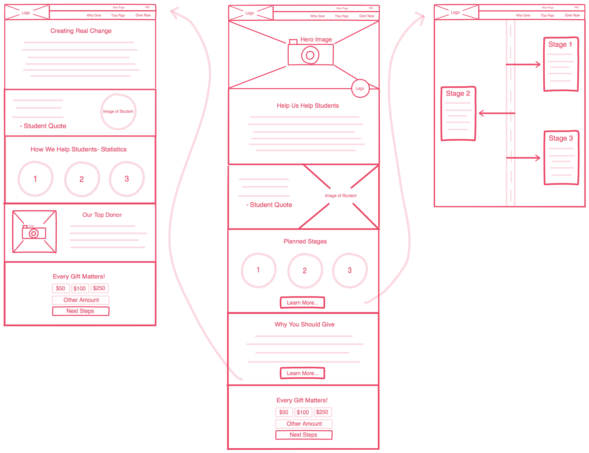
A few customer interviews lead to the initial idea of having the
following sections on the main page: Hero, The Winston Difference,
a Student Quote, Funding Stages, Why Giving Matters, and Donate
Today.
The Funding Stages, Why Giving Matters, and Donate Today sections would each link to a more detailed individual page.
This is the wireframe that resulted from that first meeting.
The Funding Stages, Why Giving Matters, and Donate Today sections would each link to a more detailed individual page.
This is the wireframe that resulted from that first meeting.

The focus with this design was on keeping the site student-oriented.
On the main page, four of the six sections directly mentioned or were
about students. There was also an entire page focused on how giving
helped real students, complete with student quotes and statistics about
student learning. This is something that was very uncommon in the high
school sites I found during research, but was quite prevalent on
university pages. It seemed prudent to include such a page on this
site, however, since one of Winton's stated goals was to differentiate
the school and directly highlight their unique approach to addressing
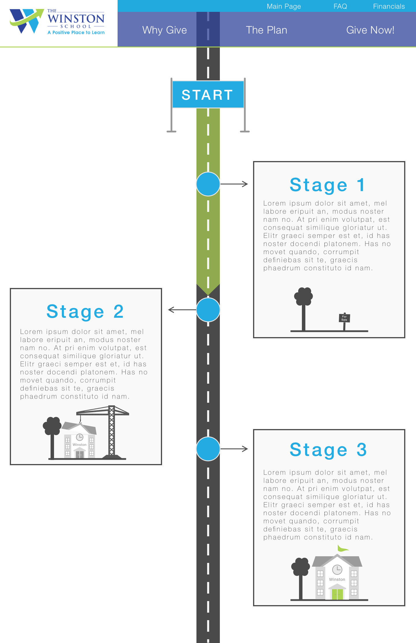
student needs. The focus on the stages page (seen to the right of the
above image) was on creating a page that did not resemble a word
document in any way. That may seem like a silly goal, but that was
so often what high school campaign sites looked like. This was the
page that was meant to make the user go "Wow! This looks worthwhile
and I should contribute to this vision" and instead was often the
simplest and most uninspiring part of campaign sites.
While the layout was well-received overall, there were a few key changes to be made. First, the client had been deciding on whether users should be able to donate through the website. Seeing the design helped them to realize that most donations made on the site would be small donations, no larger than a few hundred dollars, while most of their funding was predicted to come from a select few larger donations. Having donations on the site would increase complexity while not helping their target users, so it was scrapped. The Give Now page still existed as an individual page, except it acted more as a contact page, allowing users to get in touch with school officials to begin the donation process.
The second key change the client requested was the addition of a password protected page which would contain more sensitive information. The password would be given to high level donors so that they could access important content, such as school financials.
Mockups
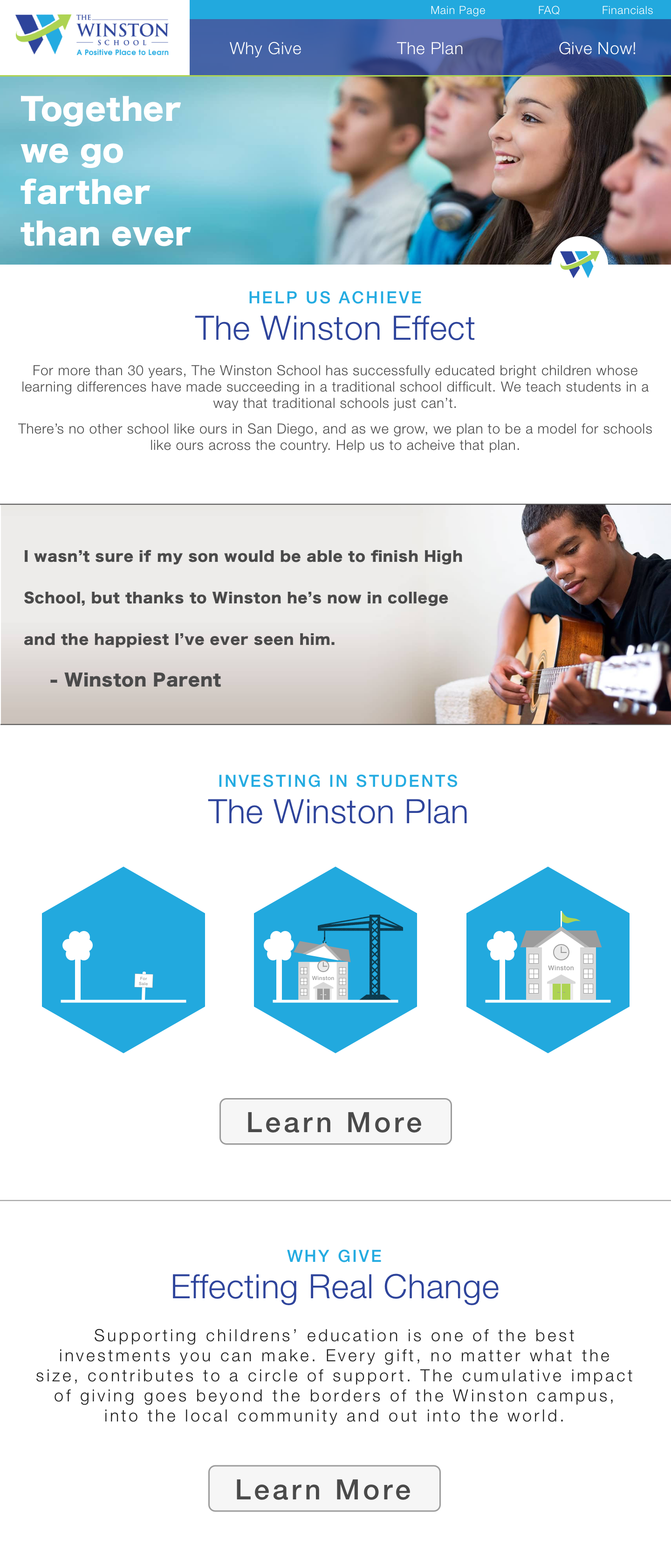
In the final design, the site is styled to resemble the existing
school website, to create cohesion between the two. This is where
the double header comes from as well as the color scheme of white,
blue, light blue, and green.


The final design ended up being very similar to the initial wireframe,
except for the two main changes mentioned above: removing the payment
feature and adding the password protection. The details are more
filled in, but it still maintains that focus on helping students and
student growth.
Implementation
This might seem to be an unnecessary section to include since Winston
wanted mockups and not a full site, however, I still wanted to research
several aspects of the design to ensure they would be easy to implement.
Here, I'll summarize the research that went into a secure donations
portal and a secure password protected section of the site.
For the payment portion of the site, I planned to use a platform called Stripe, which builds tools for internet commerce. Their collection of APIs allows businesses to securely take payments on their sites without storing any sensitive financial information on their servers. It is used by companies ranging from Google to Salesforce and adds a simple embeddable checkout form with one line of Javascript so there is no need to reinvent the wheel.
However, Stripe charges 2.9% per successful card charge and while this wouldn't have been a huge amount for small donations, this would add up quite a bit over several large donations. Since Winston was expecting a small number of large donations, this wouldn't make sense for them. This information was part of what caused Winston to decide to exclude a payments system from the scope of the site.
The password protected section of the site was a little more complicated since there wasn't a convent set of APIs ready, however, it ended up being far less difficult than I feared. I briefly toyed with the idea of having just one password that Winston could then hand out to potential investors to access this portion of the site. However, that would be insecure and since this page was meant to house some more delicate financial documents for the school, I still wanted it to be protected. The next idea was to set up a temporary, changing password system where Winston could hand out the temporary password to potential investors and then once they were logged in, they could set up their account with their own password. While the idea of temp passwords and two-factor log-ins is something that I am more used to after working with tech companies, it was immediately intimidating to a group of educators.
Instead, the final idea was to set up a small admin portal for Winston. Whenever they found a new potential investor who needed access, they would add their email into the portal. Since Winston would already have their email in order to communicate with them, this idea was much less intimidating to the educators. The website would then send the necessary login information to that email address. Once on the website, the investor could input their own password for continued login. Amazon's Simple Email Service could easily handle sending the emails.
Reflection
Successes
Overall, the site manages to be much more in-depth than most high
school capital campaign sites while not being too intimidating or
boring. The Stages page is an interesting and an effective way to
communicate how far into the goal the school is, and the Why Give
page is an important addition that reflects the main focus of the site.
Learning Moments
Researching how to build the secure password protected portion of
the site ensured that I'm ready to implement such a system in the
future. Playing around with dynamic ways to display progress on the
stages page was a fun challenge.
Takeaways
Knowing about implementation is helpful even during the design
stage because it informs the design when you know what's possible.
If you just do the design and always leave someone else to implement
it, then you might not know what design decisions are easier or more
complex to create.